Audit for the Cloud
In 2018 Deloitte had spent the previous 4 years trying to build a cloud-native platform to help their accounting specialists perform audits. The resulting platform, while containing many advantages, lacked the experience design necessary to make a tool so complex, useable for desired audience.

The Challenge
Pre-release versions of Deloitte’s global Omnia platform revealed several issues preventing widespread adoption by users. Our goal was to research how each of these issues manifested in daily interaction with the platform and offer insights and recommendations for how each could be mitigated.
Targeted pain points:
1. An unfamiliar mental model hampered productivity within the tool
2. An unintuitive interface created steep learning curves users
3. Overly complex systems as a result of excessive feature creep
4. High development debt leading to slowed rollout of critical updates
My Role
I was brought in as part of an ambitious project to research, test, and refine the user experience for enhanced usability. As the UX resource on the project, I was responsible for leading the research synthesis, heuristic analysis and design definition for all three engagement phases. I collaborated with my design manager and UI counterpart for usability testing, visual design and interaction. recommendations.
My engagement tasks:
1. Evaluate the experience for UX best practices via a Heuristic Analysis
2. Map complex audit methodologies into scalable, user-centered flow
3. Recommend UX/UI updates key areas of lower performance
4. Align product, business, and engineering stakeholders around a cohesive design system
5. Inform the UX vision going forward
The approach
This project was carried out in three separate engagement phases focusing on research, design, and executive tooling.

Qualitative Research
Over five weeks, the research team conducted twenty in-depth interviews, including nine observation sessions with a diverse group of Omnia users performing their daily tasks. The data gathered was then synthesized into overarching themes and research insights to inform short term, tactical recommendations for UX/UI improvements.
Heuristics Analysis
Overall score 3.0 / 5.0
We applied a 9-point heuristic framework to assess usability across clarity, efficiency, and consistency, giving each element a score from 1 to 5. Early-stage enterprise platforms typically score between 2.0 and 3.0, reflecting tradeoffs between depth of functionality and ease of use.
Omnia’s overall score of 3.0 aligns with this benchmark.
Omnia’s overall score of 3.0 aligns with this benchmark.


What worked well
Guided workpapers improve quality
Structured, in-browser workflows boosted consistency and auditor confidence
Integrated planning & execution
Seamless navigation between project plans and workpapers was praised by PPMDs for improving efficiency
Real-time collaboration removes bottlenecks
Cloud-based editing resolved versioning issues and enhanced team productivity
Seen as a foundation for future audit
Structured, in-browser workflows boosted consistency and auditor confidence
What needed work
Reviewers faced more friction than preparers
Reviewers struggled to complete tasks and expressed higher frustration, likely due to entrenched expectations and legacy habits
The homepage generated confusion
Users felt overwhelmed by unclear visual hierarchy and missing next-step guidance. The “Currently With Me” section added to cognitive load and lacked contextual clarity
Finding the thing is harder than doing the thing
Tasks like commenting on an SOW or completing a GRA were described as “easy” once users found where to begin. Navigation, not complexity, was the barrier.
Users wanted familiar mental models
Auditors welcomed modern tools but instinctively sought familiar structures and patterns. Too much deviation triggered hesitation and retraining fatigue
Phase 2
In phase 2 to we focused on designing UX enhancements that would reduce the platform learning curve and increase efficiency before go-live

Reducing friction through UX
What are the fundamental shifts that should be addressed before go-live?
Target areas for design
1. How might we reduce the learning curve and improve adoption?
2. How might we redefine the navigation to improve findability?
3. How might we retain the context, as the users navigate through different parts of the audit?
4. How do we optimize the reviewer experience?
5. Could we leverage Financial Statement to match the mental model?
2. How might we redefine the navigation to improve findability?
3. How might we retain the context, as the users navigate through different parts of the audit?
4. How do we optimize the reviewer experience?
5. Could we leverage Financial Statement to match the mental model?
Context through Progressive Disclosure
Progressive disclosure was quickly identified as the optimal method to maintain context throughout the primary user journey. This approach keeps the interface uncluttered, maintains an intuitive mental model, and always exposes the return path, eliminating the need to memorize complex hierarchies and reducing navigation friction.
Tree Jack navigation study
I led a Tree Jack navigation study to help me understand how my progressive navigation should be organized for greatest findability and contextualization. We were able to get over 100 participants which helped us refine the organization of content to better match user expectations.


Mid-fi exploration
By leveraging progressive disclosure, we layered navigation into three nested levels, global menus for platform-wide access, project-level tabs once an engagement is selected, and contextual sidebars for deep dives: revealing only the options users need at each stage. I used the Tree Jack results to reorganize content into more intuitive hierarchy's, making sure to maintain visual context through each level.

Hi-fi recommendations
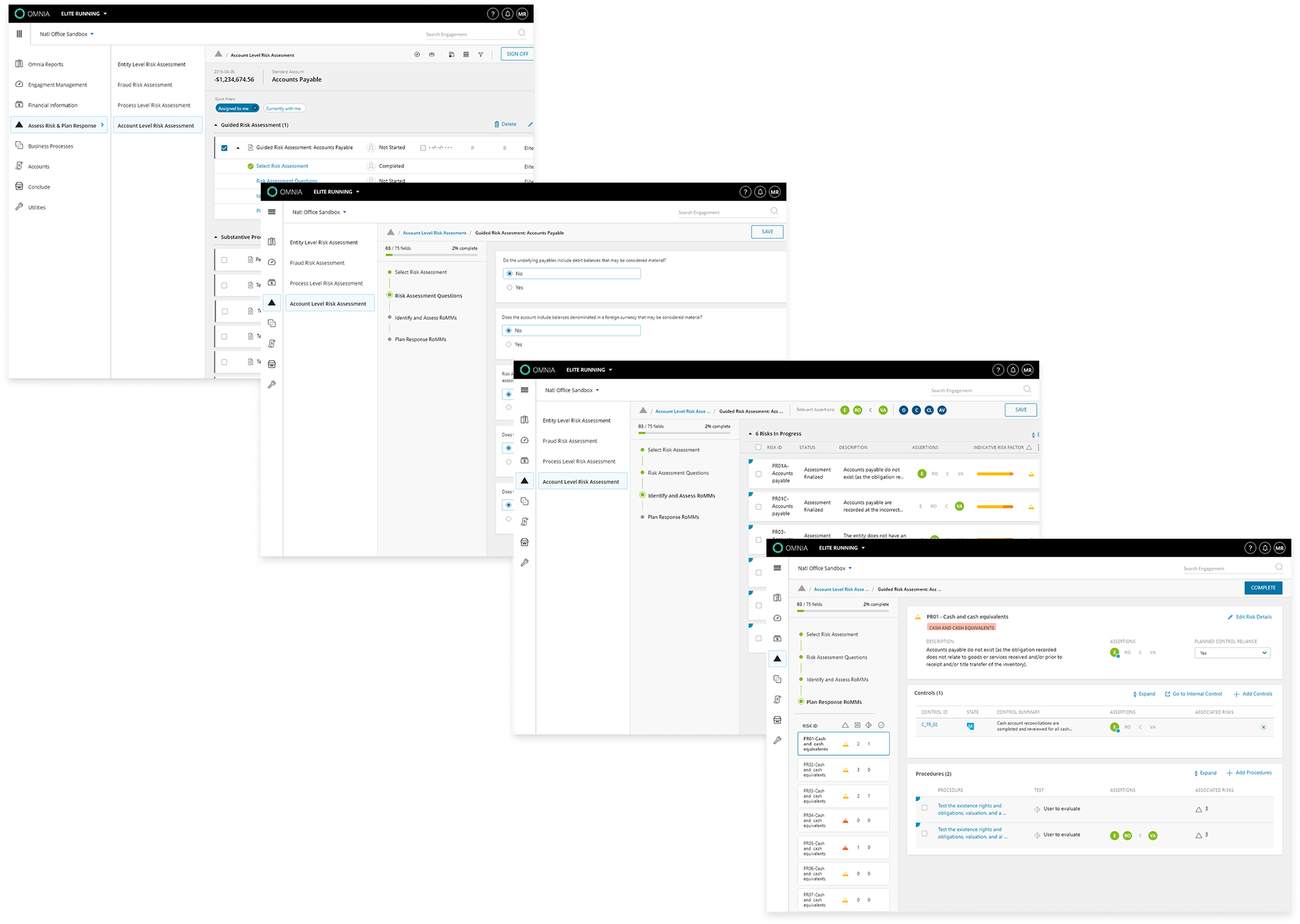
Reviewing the task flow for a Guided Risk Assessment we can see how progressive disclosure intuitively moves our users from tool discovery to the working environment, while maintaining context.
UX changes
1. Simplified global and top-level navigation and relocated account level actions to the appropriate tier
2. Used Tree Jack results to reorganized menu navigation for increased findability
3. Included breadcrumbs to help retain context and enhance learning
4. Optimized the reviewer experience with clearly delineated work areas and progress trackers?
5. Familiar mental model to programs like Quicken and Outlook
Implemented changes
Client implementations of our recommendations for V2 included several elements suggested in both Phase one and two. The complexity of the build limited the scope of those changes, but the resulting updates proved valuable enough to continue the working relationship into a third phase.


Phase 3
Phase 3 offered a new challenge, the chance to tackle the executive experience and address the lack of robust project management functionality.